Device specific content
With figma.to.website, you can change the content of your website based on the device characteristics of the visitor.figma.to.website bases everything on Figma component variants.
You can have variants for all sort of device characteristics like:
- Input mouse or touch.
- Screen orientation, landscape or portrait.
- If the input device has hover capabilities or not.
- Output is for screen or for print.
This is done with a specific Component property that should be called ‘@media’.
Some examples of values for the ‘@media’ property:
- pointer:fine = The primary input mechanism includes an accurate pointing device, such as a mouse.
- pointer:coarse = The primary input mechanism includes a pointing device of limited accuracy, such as a finger on a touchscreen.
- pointer:none = The primary input mechanism does not include a pointing device.
- orientation:portrait = The viewport is in a portrait orientation, i.e., the height is greater than or equal to the width.
- orientation:landscape = The viewport is in a landscape orientation, i.e., the width is greater than the height.
- hover:hover = The primary input mechanism can conveniently hover over elements.
- hover:none = The primary input mechanism cannot hover at all or cannot conveniently hover (e.g., many mobile devices emulate hovering when the user performs an inconvenient long tap), or there is no primary pointing input mechanism.
- screen = Website is on a screen with pixels
- print = Website is going out to printer
You can also combine them with keyword ‘and’ or a comma for “or” operations:
- (pointer:coarse) and (orientation:portrait) = Device has touch input AND is oriented in portrait.
- (pointer:coarse), (orientation:portrait) = Device has touch input OR is oriented in portrait.
See the full capabilities in the CSS media queries specs.
Figma doesn’t currently support character “=” in property values so media queries like “width <= 600px” will not work but can be replaced with “width < 601px” for the same result.
This been said, we don’t recommend the use of the “width” media queries here because figma.to.website has more convenient ways to make responsive designs. See chapter about responsive designs.
This been said, we don’t recommend the use of the “width” media queries here because figma.to.website has more convenient ways to make responsive designs. See chapter about responsive designs.
Demo
Your device
has a mouse
input
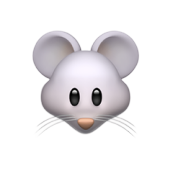
has a mouse
input
Your device
has touch
input
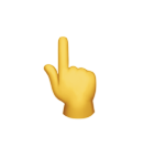
has touch
input